
The Messages Over Time report provides an overview of audience messaging activity across Bionic Portal.
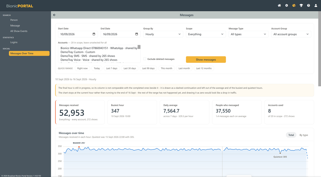
It can be used to analyse message volumes over a selected period, identify the busiest and quietest times, compare activity between accounts and understand which messaging channels are being used.
Selecting the reporting period
Use the controls at the top of the report to define the information you want to analyse.
You can select:
- Start Date and End Date
- Group By – for example hourly
- Scope
- Message Type
- Account Group
- one or more individual Accounts
Leave the account selection empty to include all accounts within the selected scope.
Frequently used periods can also be selected using the Quick Range options, including Right now, Today, Last 7 days, Last 30 days, Last 90 days, This month, Last month and Last 12 months.
Select Show messages to update the report using the chosen filters.
Summary
The summary at the top of the report shows key information for the selected period:
- Messages received – the total number of messages received
- Busiest hour – the hour with the highest message volume
- Daily average – the average number of messages received each day
- People who messaged – the number of individual audience members who sent messages
- Accounts used – the number of accounts that received messages
Where relevant, additional context is shown beneath each figure, such as the average number of messages per person or the number of accounts and shows included in the report.
Messages over time
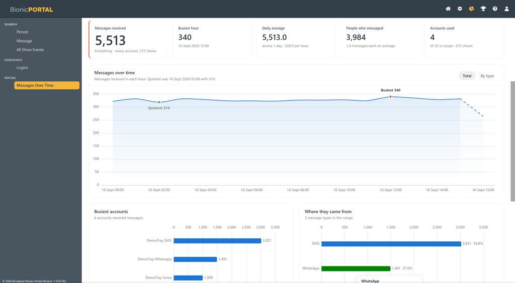
The Messages over time chart shows how message volumes changed across the selected period.
The busiest and quietest completed periods are highlighted on the chart, making it easy to identify peaks and quieter periods.
Use the Total / By type control to switch between the overall message volume and a breakdown by message type.
When the current hour is included in the report, it is shown separately as an incomplete period. Because the hour has not yet finished, it is not included when calculating the busiest or quietest hour or the averages. The chart also stops at the current time rather than showing future periods as zero activity.
Analysing accounts and message types
Further charts provide a breakdown of activity across the selected period.
Busiest accounts shows which accounts received the greatest number of messages.
Where they came from shows the number and proportion of messages received through each available message type, such as SMS, WhatsApp or Voice.
These charts make it possible to see both where audience activity is concentrated and which communication channels are being used.
Deleted messages
Where available, Exclude deleted messages can be selected to remove messages that have subsequently been deleted from the report calculations.